Did you know that most users leave your site in 10-20 seconds? Although more than 28% of people delete apps within a few days? This type of error is widespread online and derives from a failure to study a site’s usability. From a web design structural mistake, it becomes a missed marketing opportunity. This is why all digital marketing strategies need to keep an eye on the aspects of UX/UI interference. For this, you must pay attention when designing a site from scratch and when updating individual sections of an existing site. Quite frustrating, right? Want to know why? If yes, read on.
A site’s usability is the first factor that a digital marketing team should always evaluate or keep in mind when designing a site. Let’s take some examples!
When a user enters a certain keyword on a search engine, such as “Best Healthcare Marketing Agency,” he will expect to land on a site where he can have all the valuable information. On the other hand, if he found the blog of some writer who loves Indonesia, it would result in a misalignment between expectations and actual possibilities. Or maybe the user types in Google the keyword “books to buy on offer” and lands on the site of a blogger who reviews books and not on e-commerce, as he might want to do. It may be that in both cases, the site is able to offer what the user is looking for, but the failure to specify a specific menu item will still lead him to leave the site.
USER INTERFACE
The UI is known as the user interface. It indicates everything that is put between a machine and an end-user, in fact, allowing mutual interaction.
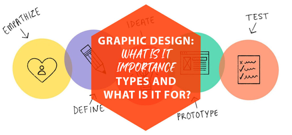
As we will see in our in-depth analysis, the process of studying or improving a site’s usability is no different from that which leads to creating a marketing strategy. In fact, both require you always to put yourself in the end-users shoes.
What are the strategies and tactics that can make a site truly usable?
First of all, it is crucial to identify the site’s objectives. They can be precise and of a temporary or promotional nature. As happens, for example, in the case of a landing page aimed at converting users into the purchase of some offer. Or it could be institutional and lasting over time. It may happen, for example, in the case of so-called showcase sites or even e-commerce. Once the site’s objectives, on which the site’s structure strongly depends, have been defined, we move on to explore the value proposition.
At this point, we should ask ourselves for what purpose users should visit the site. And what makes us unique, distinguishing us from our competitors.
Both the marketing and web design teams must share and internalize these aspects. It allows to list of the factors on which to act to obtain the best possible degree of usability must be drawn up.
The factors that have a tangible impact on usability are the following:
- Information design and labeling;
- Design of all interactions requested or suggested to the user visiting the site;
- Textual aspects, from the point of view of the terminology used and sentences length and paragraphs;
- Site speed and performance;
- Mobile optimization;
- Structure of the pages and wireframes, grids that include all the modules;
- Visual coherence and conventions (which help the user to find himself in a familiar environment).
Let’s now look at these aspects in more detail and why they are so crucial for a good digital marketing strategy.
Why UX/UI is so important for an ace digital marketing strategy?
First of all, when you start designing a site, you have to think about identifying what the hierarchy and the information architecture will be. Consequently, it will be essential to immediately think about the most important contents and the key functions it should have.
How do they relate to each other in terms of importance? The answer very often lies in the sector to which we refer, that is the one in which our company is positioned. For example, suppose our site will treat as travel content and will also have to deal with selling holiday packages. In that case, we could think of dividing the information into these macro-categories: Packages and Tours, Flights, Hotels & Apartments, What to See, and General Tips.
When we have identified the macro-categories, we have unconsciously already done the labeling process. That is, we have given a label that allows the visitor to the site to orient himself within it. To apply them correctly, however, we must first understand the conventions that are used in the sites of the competitors in the reference market. Moreover, constitute the navigation rules to which users are already accustomed.
Always when defining the architecture of the site, it will be advisable to check which features you want to be able to structure. Some features include user registration and login, access to the reserved area, the ability to buy packages, etc.
The process we have just outlined is known as information design and is necessary to clearly and unambiguously explain the information that is to be made available.
Interaction Design
Once the information has been defined, we proceed with the interaction design, i.e., with the definition of the whole range of actions that the user can perform within our site.
Even in this phase of the process, that defines a site’s usability. The insights are no different from what happens in the definition of a product or an advertising campaign for the marketing department. In fact, when you proceed with the interaction design, the goal is to put yourself in the user’s shoes. Try to identify the questions that could be asked when users land on the site. Among these questions, we find, for example,
“Where am I?”
“What service can I access?”
“How long will it take to fill out this form?”
In fact, on the web, we have no references to understand the proportions or the direction, so we’ve to use as many aids as possible.
- To provide these aids and answer the user’s questions, there are some commonly used tools, including an internal search engine,
- breadcrumbs (the “breadcrumbs” that indicate the precise position in the site path),
- And the menu with type navigation persistent.
Let’s now look at the textual level of usability.
If it seems the simplest and most intuitive on the surface, it is not. Those who surf our site do not have time to do an accurate search. They must be able to get to the information they are looking for quickly and comfortably. Especially if they are visiting the site from a mobile device. Therefore, the textual content must make it clear immediately what the value offered is and why users should remain on our site.
In terms of consistency with positioning, it is vital to pay attention to ensure that the texts are consistent with the rest of the online presence. If the brand is young, then the tone can be sparkling. If, instead, our readers will be mainly B2B, the tone will have to be more professional.
To build the internal pages while maintaining the principle of usability, they must follow the same linear and uniform structure that we have outlined for the home page. In this regard, wireframes, the grids within which the contents and buttons are organized, are particularly effective. Correct positioning of the elements within the wireframe allows for easier reading, effectively helping the process of scanning users in search of fundamental information. Furthermore, it is imperative to try to keep the same grid for several pages. In this way, we will take advantage of the learning mechanism that the user has made by visiting the previous pages.
Basically, it is necessary to reduce cognitive noise to avoid an overcrowded page creating a sense of confusion in the visitor. All site sections must be clearly identifiable and separated from each other thanks to the white space, which is very important for giving breath to the web page.
In order to lighten the amount of information contained on the page, it is possible to use “accordion” areas, i.e., areas of the page designed to explode their “accordion” content. Content expansion is usually possible by clicking on the “+” symbol, which allows you to open a hidden section of the page. This solution is ideal for giving the user the most relevant information in the visible portion of the page and keeping the extra ones hidden—moreover, it’s still accessible for those who wish to learn more.
Importance of using conventions
We mentioned earlier the importance of using conventions in order to create a site that is truly usable. Thanks to their presence, the visitor can quickly learn to use a completely new interface. This is possible because the visitor finds the same navigation logic that he has learned to use on other sites.
Some of these conventions include the logo positioned at the top left of the page, corresponding to the return to the Home, the links highlighted with an underline, and the menu at the top right. This is perhaps one of the most important aspects of the whole process aimed at improving the usability of our site. Just think, for example, of the situation in which we would find ourselves if, getting on a car unknown to us, we found the pedals, the handbrake, and controls in places where we are not used to looking for them. In essence, we would have to learn to drive again, a process that involves considerable frustration.
This example serves to understand that the sense of loss and the consequent annoyance must absolutely be avoided. So let’s not get carried away by overly creative graphics if the latter undermine conventions. The goal is always to offer an easy consultation for our visitors, especially if our goal is related to online business conversion.
Speed of the site
The last aspect is linked to the speed of the site, an aspect that appears trivial but that many underestimate, to the point of having to run for cover only once the site is online. Yet it is not clear why such a programming error, especially because speed is one of the critical factors for indexing a site for Google.
This is because even the most famous search engine in the world cares about the usability of a site and is perfectly aware that a slow site is also an unusable site.
In fact, slowness has a very negative impact on the user experience. It often leads to premature abandonment of the web page by the user.
So when we launch a new site, it is essential to check how long it takes to load the content. You can do this by going to the Google developers section. If we notice that the site loads too slowly, we must think about compressing the images used. Take all the suggestions that the speed analysis tools will suggest to optimize our site.
If you’re looking for UI/UX design services for your business, get in touch with us. We will do everything to help you entice, convert, and retain more customers by effectively improving your website.